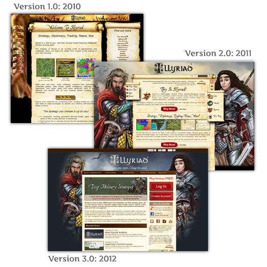
Illyriad is coming up on its 2 year anniversary since the game first launched in Alpha. In that time the external game website has been through a few versions. For 2012 and as we move into the third year of Illyriad’s existence we are happy to share with the community a new and improved website.
Why a new website?
One of my main goals as community manager at Illyriad is to make sure our players are having the best user experience than can have. In part this means that our players should have easy to access information about the game readily available. The current (now former) website just wasn’t doing that very well.
As most of our players know, Illyriad has a small cross-functional development team. This means, at any time, one of us may be working on a project that seems like it falls outside of our more formal titles. So in true Swiss army knife fashion, I set out to give the website a new coat of paint. My background (aside from community development) is in graphic design. So it’s really not quite as much of a stretch as you’d think.
Goals:
- Give the website a fresh look
- Create an easier to use navigation
- Add a community section
- More detailed information about the game
- Add FAQ and support section
- Better social media integration
- Have dynamic content and news on the front page
Process:
The first step was identifying the basic layout of the website and what sorts of content would be inside. I did this by creating a series of very rough wire-frames and a pagemap. After looking at a few options the team chose the one below:
From there I went about laying out a mock-up of the homepage in Photoshop. My philosophy with the visuals was to retain the key elements that relate to our brand but still give a clean, updated visual look. Familiar elements like the character art on the backgrounds, the parchment paper texture and red buttons relate to the former website and game while still giving a new look. One of my favorite parts to update was the treatment for the logo. The Illyriad logo has a pretty unique look and the former implementation of plain flat black wasn’t really giving it the attention it deserved. So I experimented with a few treatments and landed on a subtle silver 3D lighted effect. My biggest struggle, however, was with color. The game and former website use a lot (seriously, a lot) of beige and brown tones. I wanted to retain some connection to the game through the use of the parchment texture and beige color, but I felt that the site overall needed some more contrast and depth. I was inspired by the mottled dark blue-grey sky that was used in one of the character portraits. So after much layering and experimentation I came up with the rich blues and dark browns that are used in the new design.
After settling on the overall design and laying out mockups for the rest of the pages, we began the process of making the designs come to life. Through an amazing partnership with Illyriad CTO and technical wizard, Ben Adams (aka GM Thundercat) all of the things I imagined actually turned out to work, often times even better than I thought. The account creation and log-in pages for example are so much more slick and interactive than I thought they could be, due to some amazing HTML5 technical wizardry. The real hard work was coding and I consider myself quite a lucky designer to get to work with someone who when I asked “can we do that?” always said yes.
Overall, I am so pleased with how the website has turned out and I hope the community is as well. At some point soon™ we hope to be giving the forums a dev blog and new look as well to match the new website.
Make sure to hop over to the homepage to check it out for yourself and stop by the forums or leave comments on this post to give your feedback on the new site! I look forward to hearing everyone’s thoughts.
GM Luna


Version 3.0 is a profound improvement. I eagerly anticipate seeing the forums updated to a similarly usable and pleasant look.