One of the most important aspects of a design, aside from the look and feel of the design itself, is proper organization and labeling of layers.
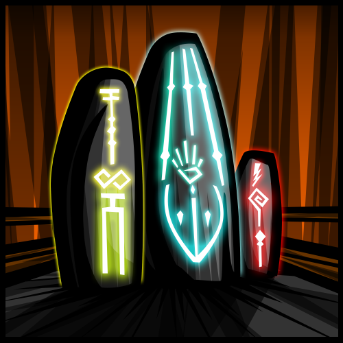
Having organized layers is paramount to the ease of re-editing a finished product after it has been published. A good example of this is work I have done recently on image phasing. Here is the original image:
My layering on this image is very simple: Each object has its own individual set of layers that I follow nearly every time. The individual stones have a contour, color, shading, and effects layer. The background is placed behind the stones with a contour, color, shading, and effects layers of its own. While working, I like to label what each layer is (this avoids the mess of “Layer 1”, “Layer 2”, “Layer 3”, etc.) so that I may quickly navigate the illustration if changes need to be made. What all this extra effort going into the illustration provides is an easy-to-modify, modular, and flexible illustration.
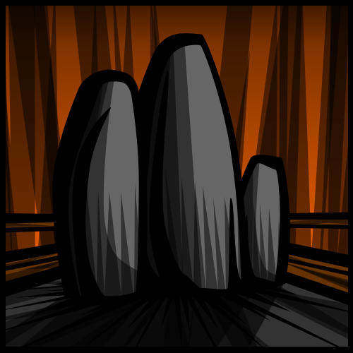
When I first made this illustration I had no idea that it would be needed for another project; however, with my methodology I was able to make the following changes without any additional effort. The project I was tasked with was to “phase” the illustration from full detail all the way down to wire frame. Here is change one for the new project:
Very easy change, this was as simple as hiding the effects layer of each of the stones and then saving the image as is. Change two was a bit more dramatic:
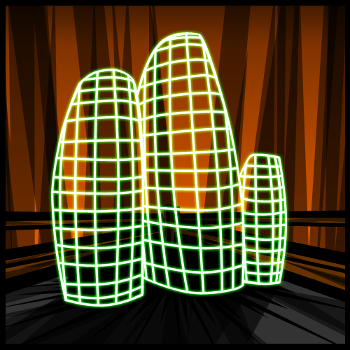
Through simply drawing over each of my stones with white lines, tweaking them a bit, and adding a minor green glow effect I was able to give the stones the look and feel of a wire frame. After the wire frame was illustrated I simply hid the contour, color, and shading layers and saved the image as is.
Having organized vector layers allowed me to complete this project quickly and effectively without having to resort to a lot of extra legwork.


