Extreme Perspective: Organized Vector Layering and Modular Graphics

One of the most important aspects of a design, aside from the look and feel of the design itself, is proper organization and labeling of layers.

Having organized layers is paramount to the ease of re-editing a finished product after it has been published.  A good example of this is work I have done recently on image phasing.  Here is the original image:

My layering on this image is very simple:  Each object has its own individual set of layers that I follow nearly every time.  The individual stones have a contour, color, shading, and effects layer.  The background is placed behind the stones with a contour, color, shading, and effects layers of its own.  While working, I like to label what each layer is (this avoids the mess of “Layer 1”, “Layer 2”, “Layer 3”, etc.) so that I may quickly navigate the illustration if changes need to be made.  What all this extra effort going into the illustration provides is an easy-to-modify, modular, and flexible illustration.

When I first made this illustration I had no idea that it would be needed for another project; however, with my methodology I was able to make the following changes without any additional effort.  The project I was tasked with was to “phase” the illustration from full detail all the way down to wire frame.  Here is change one for the  new project:

Very easy change, this was as simple as hiding the effects layer of each of the stones and then saving the image as is.  Change two was a bit more dramatic:

Through simply drawing over each of my stones with white lines, tweaking them a bit, and adding a minor green glow effect I was able to give the stones the look and feel of a wire frame.  After the wire frame was illustrated I simply hid the contour, color, and shading layers and saved the image as is.

Having organized vector layers allowed me to complete this project quickly and effectively without having to resort to a lot of extra legwork.

Extreme Perspective: Artistic Evolution

It is time to give everyone a glimpse into some of the creative process that goes into creating the graphics behind Illyriad.  Here is a step-by-step timeline of how I piece together an illustration.

Step 1: Brainstorming and Rough Sketch

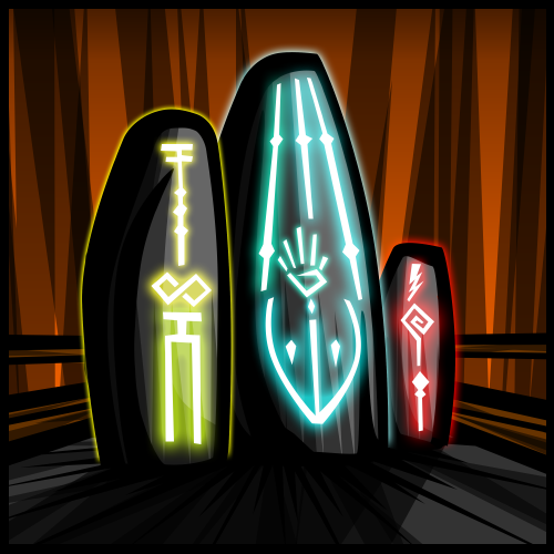
We will be implementing illustrations to the entire technology tree in Illyriad in the very near future, however as I have only been working on this project a couple of short months I have only had enough time to complete one of the trees.  To allow us to implement them now we have decided on adding in placeholders to sort of “fill in” for the real graphics while they are being produced.  The following is the creative process for a placeholder that will filling in temporarily for Magic tree graphics while they are under production.  I wanted to create something that would be all-encompassing for both present and future graphics.   When I think of magic I envision a mage or wizard spewing magic from an outstretched hand in a fan of light and energy.  I wanted to avoid something as race specific as a human or orc hand so I decided on a series of five staves fanning out from left to right from cool to warm colors.  Not only would it give a visually attractive effect it would span a variety of different schools of magic.  With this in mind I moved on to my rough sketch.

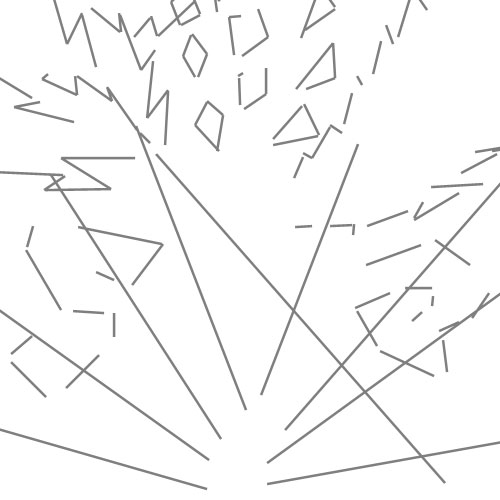
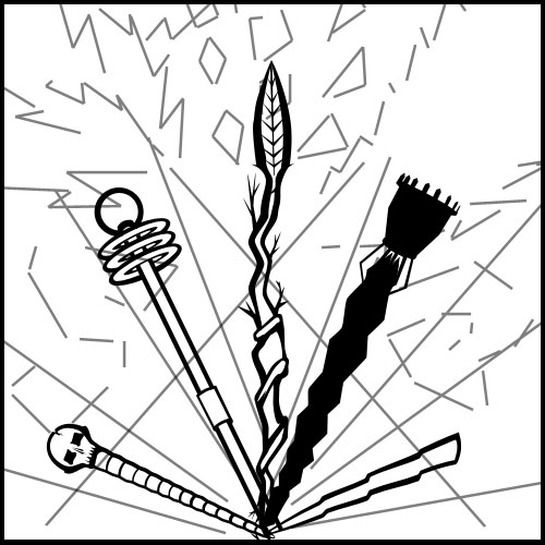
Yes, this mess of lines is going to turn into something and it really does help me bring out what I have in my head to something I can see and tweak to my liking.  This is probably the most important step in the process…it gives me a sort of skeleton for my piece, allowing me to build from the ground up around it.  I usually do this step the line tool in Photoshop. Unlike a lot of artists, I like to do even my rough sketches on the computer.  Rest assured that this ablated mess will turn into an illustration.
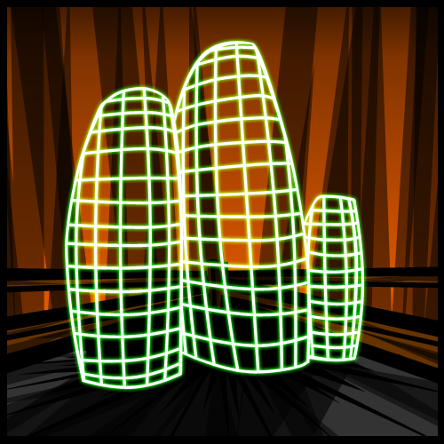
Step 2: Contour

Following my rough sketch I get into the real meat and potatoes of the illustrative process: drawing contours.  This stage really allows me to flesh out my sketch and give it some definition.  During this step I can see if my idea is really going to work or not, and I can make adjustments and see whether or not I need to scrap the idea and move to something else.

I like to keep in my rough sketch so I can still visualize the overall illustration and see what I am trying to accomplish.  Throughout the entirety of the illustrative process from here forward I use the pen tool; this phenomenal tool allows me to tweak lines and shapes through anchor points and keeps out sloppy nasty pixels.
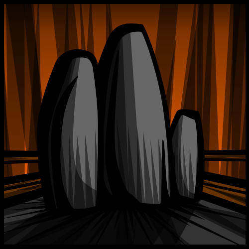
Step 3: Flat Color

After finalizing my contour lines I move on to my Flat Color step.  Here I get rid of my base sketch by hiding the layer (I never delete it as it my be useful later) and then start adding in color through using pen tool vectors of varying colors.  Vectors are very important here as well as I can shape and modify them if I don’t get the colors exactly how I like them.  A very critical point here to is to having colors beneath the contour lines.

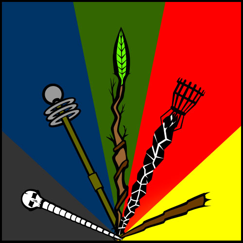
As seen here, this step can be very discouraging…it’s still not very pretty.  The colors seem not to mesh well together and everything looks very flat and bland.  Don’t worry though, once shading, glow, and gradient effects are added in it really brings the piece to life.

Step 4: Effects

Magic is the perfect illustration to demonstrate the Effect step of my creative process as some of my work completely foregoes this stage.  This particular piece had a lot of energy in a very literal sense: lightning and fire mainly.

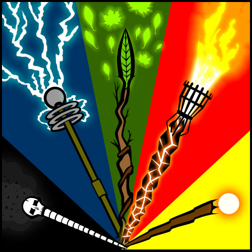
One of the most effective tools I have found for portraying very intense sources of energy is a simple white line with a colored glow around it.  This simple and effective technique gives a sense of intense energy radiating from a source.  With this step finalized I move on to the final stage of the process.

Step 6: Shading and Finalizing

By far my favorite step of the creative process is the final step of shading.  I go over the entire illustration bit by bit adding in varying degrees of shading with the pen tool, this step is what brings my pieces to life and gives them the energy I am looking for.

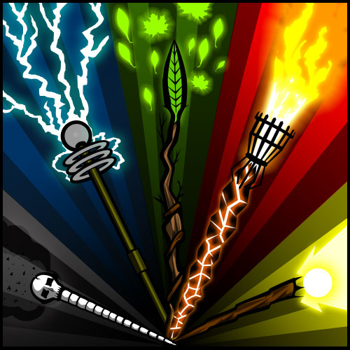
In this stage I add gradients, light and heavy transparencies, and all sorts of various effects to complete the illustration.  This gives the final piece depth, energy, and emotion.

Extreme Perspective: On the Shoulders of Giants

I have always believed that all artwork should inspire some sort of emotion, regardless of how minor the task or piece of artwork is it should trigger something.

To this end, I have found that the propaganda works World War II to be some of the most thought provoking and inspiring works of our time.  They were simple, yet powerful. They communicated a complex message to onlookers and were successful at motivating fear, anger, patriotism, and a myriad emotions in just moments.

I was also fortunate enough in my early years to stumble upon an artist by the name of Aidan Hughes a.k.a. “Brute”, a propaganda artist in the U.K. that has been working for years on a style that I feel I am just now coming into my own in implementing.  Aidan’s work is by far my greatest inspiration, as he takes what was done for art in WWII and takes it to the next level.  Each piece of artwork he produces drips with feeling and radiates a zeal unmatched anywhere else.

That sort of emotion and energy is something I try to portray in every piece I work on, be it a simple image such as Inventory Management or something more energetic like Raid.  In the game, my goal is for each piece to give an idea of what that technology brings without having to read the description, and to have that image be memorable.  I accomplish this through bold, powerful lines and exaggerated perspectives.  I attempt this also through bringing focus to the main idea of the piece with color transitions, star bursts (perhaps a bit excessively), and sweeping lines that guide the viewer through the piece.  With these components I attempt to meld them into a powerful and thought provoking image.

I can safely say that without inspiration from great World War II artists and Aidan Hughes, I wouldn’t be where I am today.  As eloquently put by Sir Issac Newton: “If I have seen further it is only by standing on the shoulders of giants.”

Extreme Perspective: Ex Nihilo

Just thought I’d take this opportunity to introduce myself and share a bit about myself.

I signed up with the Illyriad staff in taking the daunting task of providing a graphic for each individual technology in each tree.  This overwhelming project has been a wonderful experience for me to both learn and grow as an artist and designer, and I have been grateful for the task and look forward to more.

I was pulled into the staff mainly due to my work with a prior project using a unique style of “propaganda” artwork.  My use of bold lines and extreme perspectives was just what was needed for my particular project; the developers wanted to be able to tell an entire story in just a single panel…something I have proved at having an aptitude in doing.

I showed the staff some of my previous works, all of which had been strictly black and white.  Following are a couple of examples:

The staff liked what they saw and brought me on.  I will be honest I was a bit intimidated at first as I knew I was going to have to move out my my Black and White comfort zone; I had never worked with color before beyond a monochromatic color scheme…this would be new territory for me.

Fortunately the Illyriad project fit like a glove and I have been steaming along creating a unique piece of art for each technology available (and some that aren’t yet released).  I hope you all enjoy what is to come and I welcome any feedback and critiques you may have.

Please enjoy this sneak peak of an as of yet unreleased technology (Shhh! don’t tell anyone):

Research Tech: Graphic Sneak Peak

Hey folks!

Thanks for stopping by the new Blog, we’ve got a lot of exciting stuff coming and this is going to be a great platform for the development staff to showcase all the new things that are coming down the pipe for Illyriad.  I just wanted to post a sneak peak of some of the new graphics that will be implemented to the technology tree.  The following is just a sample of many pieces that will adorn each technology in each tree.

Hope you’ve enjoyed a sneak peak of what’s to come.  More to follow in the coming days!