GM Cerberus: Behind Illyriad’s Art

Billetmaking

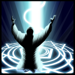
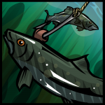
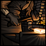
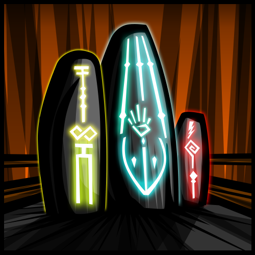
We’ve always loved the artwork inside of Illyriad and now, Age of Ascent, the upcoming MMO shooter we’ve been working on. So, who makes all of those pretty pictures, graphics and icons that you see while playing? It’s GM Cerberus, that’s who. We wanted to let him talk about himself so that you, the player, can get to know this superbly creative individual who pops into chat once in a while.

What got you started in art?

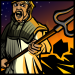
I’ve loved creating art from a very young age, I was fortunate enough to be raised by a family of artists; my mother being a singer/writer and my grandmother being a painter. They helped and encouraged me to cultivate my talents. What really got me into art, though, was video games. I loved drawing Samus from Metroid and Mega Man bosses as a kid, and I would occasionally get in trouble in grade school for doodling when I should have been working on school work.

What is it like making art for the specifics of a video game? How is it different than other projects?

It has been a learning experience from the get-go. There are a lot of technical aspects when creating digital art that you don’t have to account for in physical media. Not everyone who views the work I create is viewing it at the same settings I am, for example, there are different resolutions and browsers to take into account. Heck, some people’s monitors aren’t even correctly color calibrated. One of the biggest things, however, is that i’m creating artwork not just for form but for function. Everything I create has a purpose in some game mechanic, and seeing it all in place and functional in-game brings on a sense of self-satisfaction unrivaled by any other project I’ve ever undertaken.

Do you have an estimate of how many pieces of art you’ve made for Illyriad? How about for Age of Ascent so far?

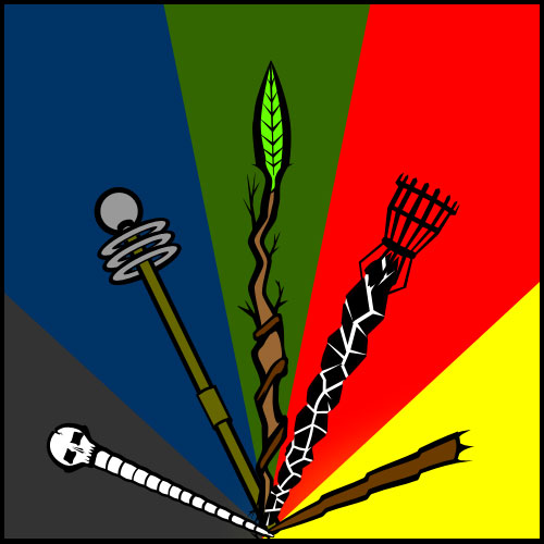
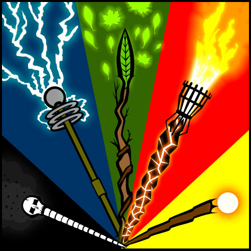
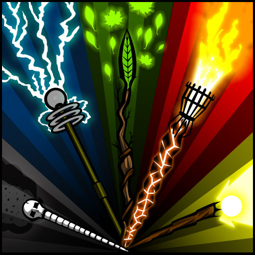
I’ve done upwards of 250-300 “large” pieces that players can view in the tech tree in Illyriad and hundreds of other miscellaneous graphics and doodads that I can’t even begin to put a number on. It would be difficult to put a number on Age of Ascent as well, but I’d be safe in saying it’s over 100 pieces. These numbers can be misleading however, as I’m including something as small as a scout unit or afterburner icon.

Do you have a preference of working on fantasy or sci-fi stuff?

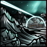
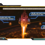
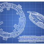
I’m really torn on this, so much that I feel like two different artists when I’m working on the styles. With my fantasy work I feel more at liberty to have them look hand illustrated where with science fiction I feel the need for precision and almost have the work be Trompe l’oeil. With Illyriad most of my work is done using a form of vector illustration and some freehand with a tablet, and on Age of Ascent it’s a lot of photo-manipulation illustration and a bit of drafting. I can’t claim favorites honestly, I’m fortunate enough to have the freedom to explore so many different styles that I love them all.

What is your process like? Do you sketch? Work on paper or all digital?

My process is very traditional in the sense that I start with a very basic sketch to act as a skeleton for the piece, and work up from there. My vector illustrations, for example: I begin by getting a very basic sketch, sometimes I refer to photos I take and chop up to insure I get my angles and proportions correctly, and then I create the dark contour lines. After the contour is complete I move to coloration and then shading to give the piece depth and light. For work with Illyriad and Age of Ascent I don’t really touch paper, everything can be done digitally and it’s very convenient to not have to scan in sketches or attempt to translate what I created on paper to digital media.

How do you create so many pieces of art while still maintaining your sanity?

Who said anything about me being sane? I very much doubt my sanity and it spirals downward daily. Seriously though, as I said before I am fortunate enough to have the privilege of being able to work on a myriad different styles. If I get burnt out on making logos for corporations in Age of Ascent I can switch over to creating freehand military units, isometric machines, blueprints, or vector illustrations. Variety is what keeps me sane, and I have lots of it.

Thanks to Cerberus for taking the time to talk with the blog. Now, get back to work! Those drawings won’t draw themselves!

Better Than It Needs To Be

The strength of Illyriad’s character art is that it isn’t as good as it needs to be. It’s deliberately much better than it needs to be.

It’s the Abba theory. Abba, the theory goes, may be at heart mere Pop music, but it has stood the test of time and is still well loved, because it is much better than it needs to be. Abba may be inconsequential Pop, but it’s so wonderfully crafted that decades later the songs can still delight.

The character art for Illyriad has been broadly praised, and many of the individual portraits have a quality that brings a smile to the face. The key to this, I think, is that we didn’t set out to make the characters good enough, appropriate, acceptable. We set out to make them brilliant, and then poured love into them. It’s easy to say, but hard to do – and requires a much greater focus on the details. Look, for example, at this close-up of our male Dwarf – at his pauldron and the buckle on his breast-plate:

No-one ever needs to see the character this close up. Players will see this piece of armor at between 10% and 30% of this size. We never said to ourselves “do we need to show scratches and chips on his armor? do we need that much subtlety in the texture on the metal?” We just put the detail in without questioning it, because we were determined to make the portrait brilliant. But having lavished love on each inch of a character, the overall effect, when you stand back and look at him or her from a distance, is that the quality shines through.

Revising the Character Art

When we came to revise the character art for Illyriad, it seemed clear that the first batch of characters should be warrior-kings and warrior-queens.

This calls to mind King Arthur (who in his prime, most people imagine as thirty-something), Genghis Khan (whose power was at its peak when he was in his fifties) and Alexander the Great (at his greatest in his late twenties). History and fantasy fiction are both full of warrior-kings who are thirty-something-ish, physically fit, with huge charisma.

But warrior-queens? Ah, now that was a problem. History is not full of strong, female warrior-rulers, and most that do crop up are contentious or little-known. Meanwhile, fantasy fiction tends to present a rather different view of female characters.

I saw the new Conan movie last night. It was full of capable male characters, aged anywhere from 15 to 50, many of them ugly, and all allowed to develop their own way of being cool. The key female characters, meanwhile, were indeterminately young, and implausibly good looking. This kind of predictable view of females in fantasy (maid, mother or crone – mostly maid, and generally only she is allowed to be kick-ass) was a challenge for us.

My first instinct was to say “b******s to that – we’ll have our females in Illyriad as real ass-kicking females would be – unsympathetic, beefy, no prettier nor uglier than the average – lets make them real”. But of course, we’re doing this for our players, not for ourselves, and a lot of people like the athletic warrior-maid ideal.

We considered both extremes. We considered a compromise. But then we settled on the solution of exploring both ends of the spectrum.

We wanted one character who was the sort of woman who would really want to go to war and crack skulls. As we evolved the mood board, we realised that a lot of the images we liked were Baba Yaga – so, our female Orc was born.

And of course we had to have one athletic-warrior-supermodel type, and she swiftly became the Elf.

The character I personally liked the most, was the Human. She’s probably over 40 (though, hey, this is fantasy, so she’s well-preserved for her 40s, and uses cosmetics), she’s good looking without it being obvious, and she has made sure that she’s well armored (close up you can even see that the red under-armor is heavy-duty brigandine, not some sort of soft quilt). And she has the gravitas, the authority, that you’d expect from someone who rules her own fiefdom. She’s a female ruler whom I can immediately believe in.

I was pretty happy with the results. Until I put the image together for this blog piece. Look at the picture. Face, palm. Doh!

Maid, mother and crone.

They are pretty cool. But it’s still the three stereotypes.

For the next batch of art, we’re going to have to find ways to be cool without reverting to any of these three types.

Extreme Perspective: Artistic Evolution

It is time to give everyone a glimpse into some of the creative process that goes into creating the graphics behind Illyriad.  Here is a step-by-step timeline of how I piece together an illustration.

Step 1: Brainstorming and Rough Sketch

We will be implementing illustrations to the entire technology tree in Illyriad in the very near future, however as I have only been working on this project a couple of short months I have only had enough time to complete one of the trees.  To allow us to implement them now we have decided on adding in placeholders to sort of “fill in” for the real graphics while they are being produced.  The following is the creative process for a placeholder that will filling in temporarily for Magic tree graphics while they are under production.  I wanted to create something that would be all-encompassing for both present and future graphics.   When I think of magic I envision a mage or wizard spewing magic from an outstretched hand in a fan of light and energy.  I wanted to avoid something as race specific as a human or orc hand so I decided on a series of five staves fanning out from left to right from cool to warm colors.  Not only would it give a visually attractive effect it would span a variety of different schools of magic.  With this in mind I moved on to my rough sketch.

Yes, this mess of lines is going to turn into something and it really does help me bring out what I have in my head to something I can see and tweak to my liking.  This is probably the most important step in the process…it gives me a sort of skeleton for my piece, allowing me to build from the ground up around it.  I usually do this step the line tool in Photoshop. Unlike a lot of artists, I like to do even my rough sketches on the computer.  Rest assured that this ablated mess will turn into an illustration.

Step 2: Contour

Following my rough sketch I get into the real meat and potatoes of the illustrative process: drawing contours.  This stage really allows me to flesh out my sketch and give it some definition.  During this step I can see if my idea is really going to work or not, and I can make adjustments and see whether or not I need to scrap the idea and move to something else.

I like to keep in my rough sketch so I can still visualize the overall illustration and see what I am trying to accomplish.  Throughout the entirety of the illustrative process from here forward I use the pen tool; this phenomenal tool allows me to tweak lines and shapes through anchor points and keeps out sloppy nasty pixels.

Step 3: Flat Color

After finalizing my contour lines I move on to my Flat Color step.  Here I get rid of my base sketch by hiding the layer (I never delete it as it my be useful later) and then start adding in color through using pen tool vectors of varying colors.  Vectors are very important here as well as I can shape and modify them if I don’t get the colors exactly how I like them.  A very critical point here to is to having colors beneath the contour lines.

As seen here, this step can be very discouraging…it’s still not very pretty.  The colors seem not to mesh well together and everything looks very flat and bland.  Don’t worry though, once shading, glow, and gradient effects are added in it really brings the piece to life.

Step 4: Effects

Magic is the perfect illustration to demonstrate the Effect step of my creative process as some of my work completely foregoes this stage.  This particular piece had a lot of energy in a very literal sense: lightning and fire mainly.

One of the most effective tools I have found for portraying very intense sources of energy is a simple white line with a colored glow around it.  This simple and effective technique gives a sense of intense energy radiating from a source.  With this step finalized I move on to the final stage of the process.

Step 6: Shading and Finalizing

By far my favorite step of the creative process is the final step of shading.  I go over the entire illustration bit by bit adding in varying degrees of shading with the pen tool, this step is what brings my pieces to life and gives them the energy I am looking for.

In this stage I add gradients, light and heavy transparencies, and all sorts of various effects to complete the illustration.  This gives the final piece depth, energy, and emotion.

Extreme Perspective: On the Shoulders of Giants

I have always believed that all artwork should inspire some sort of emotion, regardless of how minor the task or piece of artwork is it should trigger something.

To this end, I have found that the propaganda works World War II to be some of the most thought provoking and inspiring works of our time.  They were simple, yet powerful. They communicated a complex message to onlookers and were successful at motivating fear, anger, patriotism, and a myriad emotions in just moments.

I was also fortunate enough in my early years to stumble upon an artist by the name of Aidan Hughes a.k.a. “Brute”, a propaganda artist in the U.K. that has been working for years on a style that I feel I am just now coming into my own in implementing.  Aidan’s work is by far my greatest inspiration, as he takes what was done for art in WWII and takes it to the next level.  Each piece of artwork he produces drips with feeling and radiates a zeal unmatched anywhere else.

That sort of emotion and energy is something I try to portray in every piece I work on, be it a simple image such as Inventory Management or something more energetic like Raid.  In the game, my goal is for each piece to give an idea of what that technology brings without having to read the description, and to have that image be memorable.  I accomplish this through bold, powerful lines and exaggerated perspectives.  I attempt this also through bringing focus to the main idea of the piece with color transitions, star bursts (perhaps a bit excessively), and sweeping lines that guide the viewer through the piece.  With these components I attempt to meld them into a powerful and thought provoking image.

I can safely say that without inspiration from great World War II artists and Aidan Hughes, I wouldn’t be where I am today.  As eloquently put by Sir Issac Newton: “If I have seen further it is only by standing on the shoulders of giants.”

Extreme Perspective: Ex Nihilo

Just thought I’d take this opportunity to introduce myself and share a bit about myself.

I signed up with the Illyriad staff in taking the daunting task of providing a graphic for each individual technology in each tree.  This overwhelming project has been a wonderful experience for me to both learn and grow as an artist and designer, and I have been grateful for the task and look forward to more.

I was pulled into the staff mainly due to my work with a prior project using a unique style of “propaganda” artwork.  My use of bold lines and extreme perspectives was just what was needed for my particular project; the developers wanted to be able to tell an entire story in just a single panel…something I have proved at having an aptitude in doing.

I showed the staff some of my previous works, all of which had been strictly black and white.  Following are a couple of examples:

The staff liked what they saw and brought me on.  I will be honest I was a bit intimidated at first as I knew I was going to have to move out my my Black and White comfort zone; I had never worked with color before beyond a monochromatic color scheme…this would be new territory for me.

Fortunately the Illyriad project fit like a glove and I have been steaming along creating a unique piece of art for each technology available (and some that aren’t yet released).  I hope you all enjoy what is to come and I welcome any feedback and critiques you may have.

Please enjoy this sneak peak of an as of yet unreleased technology (Shhh! don’t tell anyone):